· yebor974 · Advanced Techniques, Integration Guides, Tutorials
Guide to using Filament Components in public-facing pages
Learn how to integrate Filament components into your public-facing pages with this step-by-step guide.

This guide will show you how to include Filament components in your public-facing pages, step by step.
Step 1: Register your Filament colors globally
First, register your Filament colors in the AppServiceProvider inside the boot method:
use Filament\Support\Colors\Color;
use Filament\Support\Facades\FilamentColor;

class AppServiceProvider extends ServiceProvider
{
    /**
     * Bootstrap any application services.
     */
    public function boot(): void
    {
        FilamentColor::register([
            'danger' => Color::Red,
            'gray' => Color::Zinc,
            'info' => Color::Blue,
            'primary' => Color::Amber,
            'success' => Color::Green,
            'warning' => Color::Amber,
        ]);

        //...
    }
}
Step 2: Set up the required Blade directives
To use Filament components on the front end, include the necessary styles and scripts in your Blade layout file (e.g., layouts/app.blade.php):
<!DOCTYPE html>
<html lang="en">
<head>
    <meta charset="UTF-8">
    <meta name="viewport" content="width=device-width, initial-scale=1.0">
    <title>@yield('title')</title>

    <!-- Include Filament styles -->
    @filamentStyles

    @vite(['resources/css/app.css', 'resources/js/app.js'])
</head>
<body>
    @yield('content')

    <!-- Include Filament scripts -->
    @filamentScripts
</body>
</html>
@filamentStyles and @filamentScripts are essential for loading Filament's assets.
Step 3: Configure Tailwind for Filament
Filament uses Tailwind CSS for styling, so you need to include Filament’s Tailwind configuration preset in your Tailwind setup.
Update your tailwind.config.js file as follows:
import preset from './vendor/filament/filament/tailwind.config.preset';

export default {
    content: [
        './resources/**/*.blade.php',
        './vendor/filament/**/*.blade.php',
    ],
    //...
    presets: [preset],
};
This configuration ensures that Tailwind recognizes Filament’s styles and applies them correctly in your front office.
Then, rebuild your CSS:
npm run build
Step 4: Use Filament components
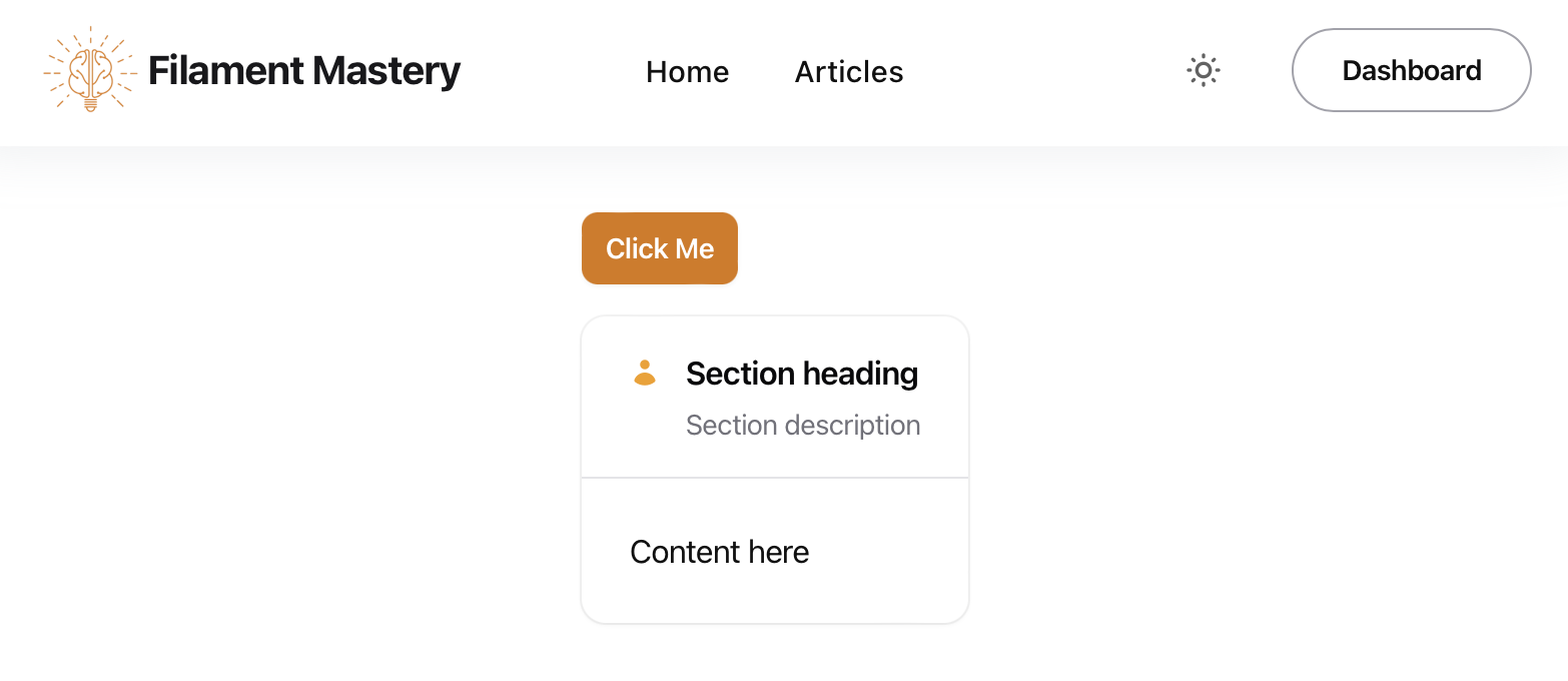
Now you can use Filament components directly in your front office. For example, if you want to add a simple Filament button or section, you can do so like this:
<x-filament::button color="primary">
    Click Me
</x-filament::button>

<x-filament::section icon="heroicon-m-user"
                     icon-size="sm"
                     icon-color="primary"
                     class="mt-4">
    <x-slot name="heading">
        Section Heading
    </x-slot>

    <x-slot name="description">
        Section Description
    </x-slot>

    Content here
</x-filament::section>

Other components, such as Blade components, can also be used with the same syntax.
Bonus: Add Notification Component
To use the notification component on your front-facing pages, follow these steps:
-
Register the Livewire Notifications Component
Add the
@livewire('notifications')directive to your layout:<!DOCTYPE html> <html lang="en"> <head> <meta charset="UTF-8"> <meta name="viewport" content="width=device-width, initial-scale=1.0"> <title>@yield('title')</title> <!-- Include Filament styles --> @filamentStyles @vite(['resources/css/app.css', 'resources/js/app.js']) </head> <body> @livewire('notifications') @yield('content') <!-- Include Filament scripts --> @filamentScripts </body> </html> -
Send Notifications
You can notify your web visitors programmatically. For example, use the following snippet to show a rate-limiting warning:
use Filament\Notifications\Notification;

Notification::make()
    ->warning()
    ->title('Too many requests.')
    ->body("Slow down! Please wait another {$exception->secondsUntilAvailable} seconds to subscribe.")
    ->send();

Integrating Filament components into your application's front office can significantly enhance its functionality while maintaining a consistent design language with your admin panel. With just a few steps, you can leverage the power of Filament for both back-end and front-end development.
Enjoyed this article? Like it to let me know! You can share it too!
 Filament Mastery