 Filament Mastery
· yebor974 · Advanced Techniques, Tutorials, UI/UX Design
Filament Widgets: Grid Layout, Dashboard & Responsive Design
Learn how to structure Filament widgets with a flexible grid layout for a responsive and customizable dashboard.

Customizing the Filament Admin Panel Dashboard
Filament provides a powerful and flexible dashboard system, allowing developers to tailor the admin panel to their needs. In this guide, we’ll explore how to define a custom dashboard by leveraging inheritance, responsive column layouts, and dynamic widgets.
Creating a custom dashboard
To override the default Filament dashboard, first create a new class extending Filament\Pages\Dashboard. This class should be placed in the Pages directory of the panel, which by default is located at app/Filament/Pages/.
If you have multiple panels, ensure the custom dashboard is placed within the correct panel directory.
namespace App\Filament\Pages;

use Filament\Pages\Dashboard as DefaultDashboard;

class Dashboard extends DefaultDashboard
{ }
Registering the custom dashboard in the panel provider
To use your custom dashboard, you need to remove the default declaration in the panel provider by removing it in the pages call:
namespace App\Providers\Filament;

use Filament\Facades\Filament;
use Filament\PanelProviders\PanelProvider;
use App\Filament\Pages\CustomDashboard;

class AdminPanelProvider extends PanelProvider
{
    public function panel(Panel $panel): Panel
    {
        return $panel
            //...
            ->pages([])
            //...;
    }
}
Defining the grid of your dashboard
To define the number of columns in your dashboard grid, override the getColumns method:
namespace App\Filament\Pages;

use Filament\Pages\Dashboard as DefaultDashboard;

class Dashboard extends DefaultDashboard
{
    public function getColumns(): int | string | array
    {
        return 3;
    }
}
By default, the dashboard grid has 2 columns. It must be between 1 and 12.
If you want a responsive grid, define it with breakpoints like this:
namespace App\Filament\Pages;

use Filament\Pages\Dashboard as DefaultDashboard;

class Dashboard extends DefaultDashboard
{
    public function getColumns(): int | string | array
    {
        return [
            'md' => 4,
            'xl' => 6,
        ];
    }
}
This method ensures a responsive grid layout where:
- On medium screens (
md), there will be 4 columns. - On extra-large screens (
xl), there will be 6 columns.
Creating and registering a Widget
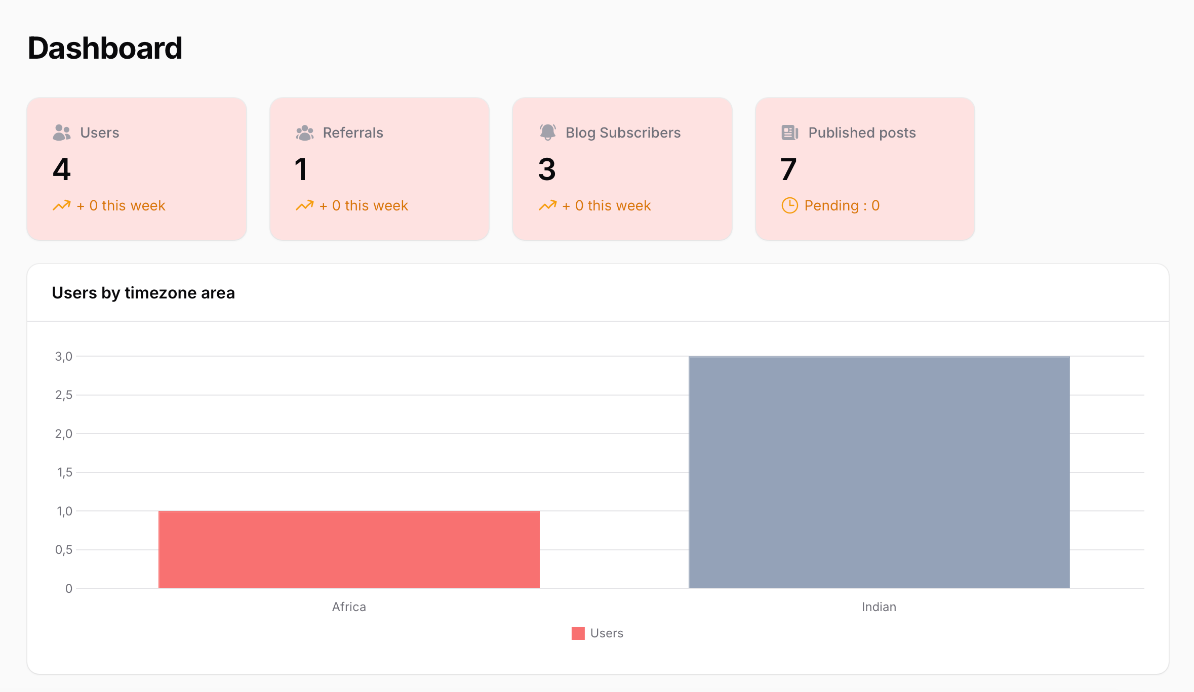
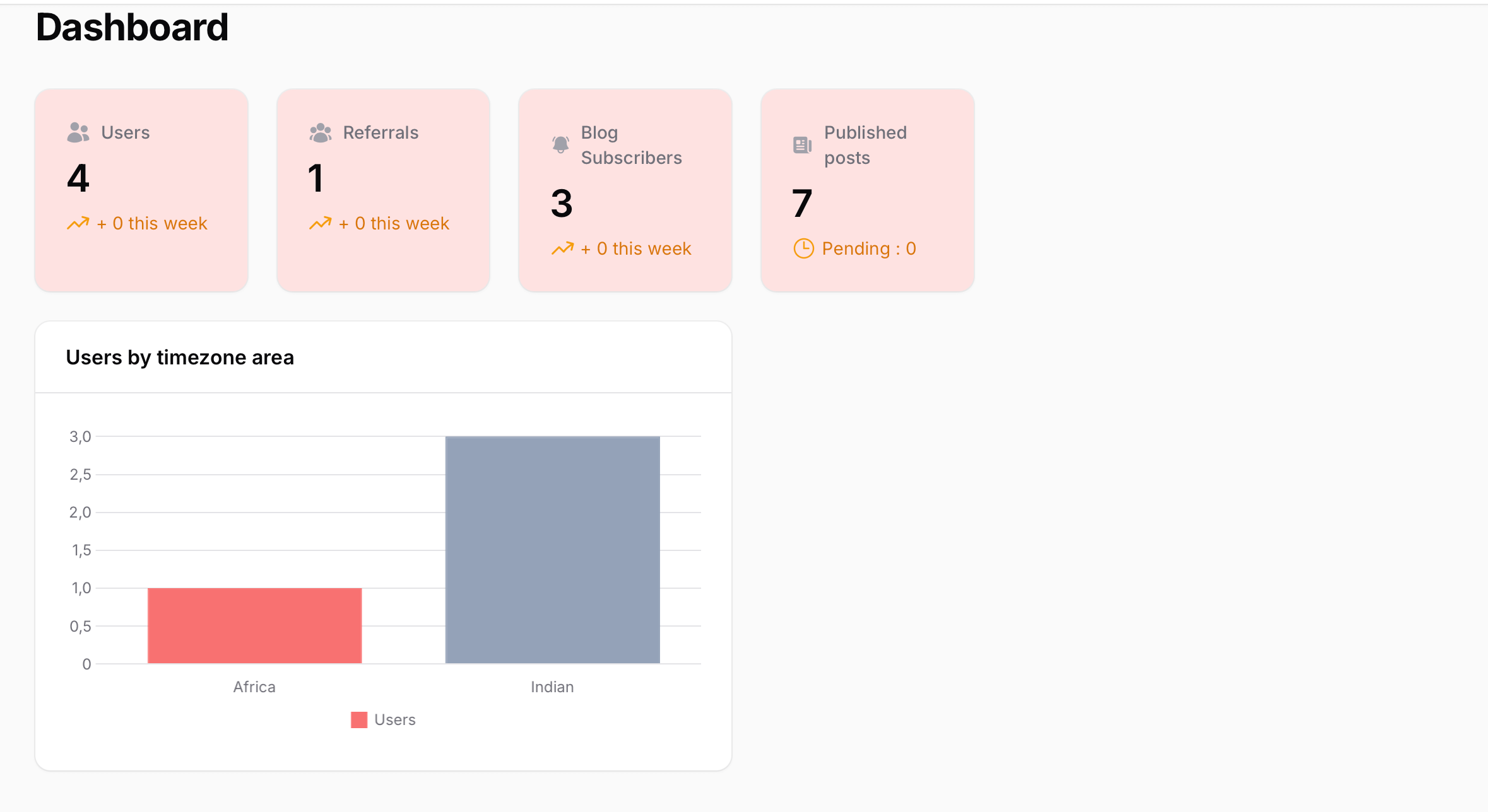
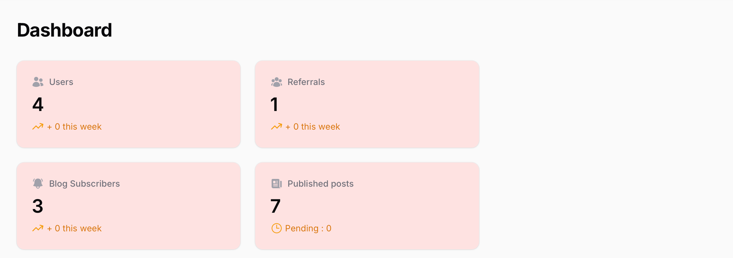
Filament widgets allow you to add interactive elements such as charts, tables, and statistics.
Creating a basic Widget
In this example, we will create a StatsOverview widget using the following command:
php artisan make:filament-widget StatsOverview --stats-overview
This command generates the widget in app\Filament\Widgets:
namespace App\Filament\Widgets;

use Filament\Widgets\Widget;

class StatsOverview extends Widget
{
    protected function getStats(): array
    {
        //...
    }
}
Defining the width of your Widget
The columnSpan property defines how many columns of the parent component (e.g., the dashboard) the widget uses.
For a Static Dashboard Grid
You can define the number of parent columns the widget spans:
protected int | string | array $columnSpan = 2;
The value must be less than or equal to the number of columns in your dashboard grid.
For a Responsive Dashboard Grid
You can define the column span with breakpoints like this:
namespace App\Filament\Widgets;

use Filament\Widgets\Widget;

class StatsOverview extends Widget
{
    protected int | string | array $columnSpan = [
        'md' => 2,
        'xl' => 3,
    ];
}
Here, the widget spans:
- 2 columns on medium screens (
md). - 3 columns on extra-large screens (
xl).
Alternatively, if you want a full-width widget (occupying the entire width of the dashboard grid), declare this:
protected int | string | array $columnSpan = 'full';
In a Stats widget, you can combine it with the
getColumns()method to define how many columns the widget contains.
Registering the Widget in the dashboard
By default, Filament automatically loads widgets from a specified directory. You can configure this in the panel provider:
public function panel(Panel $panel): Panel
{
    return $panel
        //....
        ->discoverWidgets(in: app_path('Filament/Widgets'), for: 'App\\Filament\\Widgets')
        //...;
}
Alternatively, you can manually register the widget with the widgets method in the panel provider:
use Filament\Widgets\StatsOverview;

public function panel(Panel $panel): Panel
{
    return $panel
        //....
        ->widgets([StatsOverview::class])
        //...;
}
Or, you can manually register the widget in your custom Dashboard class:
namespace App\Filament\Pages;

use Filament\Pages\Dashboard as DefaultDashboard;
use Filament\Widgets\StatsOverview;

class Dashboard extends DefaultDashboard
{
    public function getWidgets(): array
    {
        return [
            StatsOverview::class,
        ];
    }
}
⚠️ Warning: If you use this last method, automatic widget discovery will be disabled.
Examples with a Responsive Dashboard Grid and an xl breakpoint of 6
- A Stats widget with an
xlbreakpoint of 4 and a Chart widget with anxlbreakpoint of 3
#In stats widget
protected int | string | array $columnSpan = [
    'xl' => 4,
];

#In chart widget
protected int | string | array $columnSpan = [
    'xl' => 3,
];
- A Stats widget with an
xlbreakpoint of 4 but a number of columns of 2 (declares with thegetColumns()method in the widget):
protected int | string | array $columnSpan = [
    'xl' => 4,
];

protected function getColumns(): int
{
    return 2;
}
- A Stats widget with an
xlbreakpoint of 5 and a Chart widget with a full-width layout
#In stats widget
protected int | string | array $columnSpan = [
    'xl' => 5,
];

#In chart widget
protected int | string | array $columnSpan = 'full'