Customize your Filament panel theme
Learn how to create and apply custom themes for Filament panels, including setting sidebar colors, defining primary colors, and customizing integrated elements.

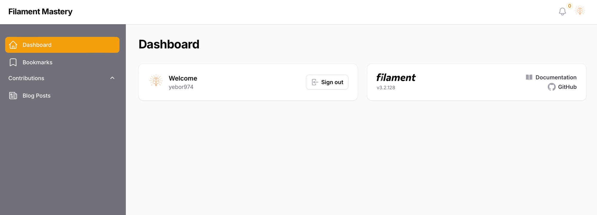
Filament provides a flexible theming system that allows you to modify the look and feel of your admin panel. In this article, we’ll explore how to create and apply custom themes for specific panels.
Setting primary colors for panels
Filament allows you to define primary colors for panels, which affect buttons, links, and other interactive elements. Use the Filament\Support\Colors\Color class for defining colors.
Option 1: Define colors per panel
You can specify primary colors directly in your Panel Provider. Here’s how to set the colors in your AdminPanelProvider:
use Filament\Support\Colors\Color;

public function panel(Panel $panel): Panel
{
    return $panel
        ...
        ->colors([
            'danger' => Color::Rose,
            'gray' => Color::Gray,
            'info' => Color::Blue,
            'primary' => Color::Indigo,
            'success' => Color::Emerald,
            'warning' => Color::Orange,
        ])
        ...
}
This will override the default primary colors for the specified panel.
Option 2: Define colors globally
To apply primary colors globally across all panels, you can define them in the AppServiceProvider:
<?php

namespace App\Providers;

use Illuminate\Support\ServiceProvider;
use Filament\Support\Colors\Color;
use Filament\Filament;

class AppServiceProvider extends ServiceProvider
{
    public function boot(): void
    {
        Filament::defaultColors([
            'danger' => Color::Rose,
            'gray' => Color::Gray,
            'info' => Color::Blue,
            'primary' => Color::Indigo,
            'success' => Color::Emerald,
            'warning' => Color::Orange,
        ]);
    }
}
Creating a custom theme
To customize your Filament panel, you can create a new theme and register it to the panel of your choice.
Step 1: Generate theme files and register it
Run the following Composer command to automatically generate the necessary theme files:
composer create filament:theme
You’ll be prompted to enter a panel name (default: admin).
This command creates the required structure for your custom theme in the resources/css/filament/{panel_name} directory: theme.css and tailwind.config.js files.
Next, in your Panel Provider, add your custom generated CSS file using the viteTheme method:
<?php

namespace App\Providers;

use Filament\Panel;
use Filament\PanelProvider;

class AdminPanelProvider extends PanelProvider
{
    public function panel(Panel $panel): Panel
    {
        return $panel
            ...
            ->viteTheme('resources/css/filament/admin/theme.css')
            ...
    }
}
By doing this, your custom theme will only apply to the Admin Panel.
Next, you need to register the theme on the vite.config.js file:
import { defineConfig } from 'vite';
import laravel from 'laravel-vite-plugin';

export default defineConfig({
    plugins: [
        laravel({
            input: [
                'resources/css/app.css',
                'resources/js/app.js',
                'resources/css/filament/member/theme.css'
            ],
            refresh: true,
        }),
    ],
});
Step 2: Define your custom theme
Now, in your resources/css/filament/{panel_name} directory, you can customize your theme.
You can find common hook class abbreviations on the Filament Documentation .
For this example, we’ll modify the sidebar color and some integrated element styles:
@import '/vendor/filament/filament/resources/css/theme.css';

@config 'tailwind.config.js';

.fi-sidebar {
    @apply !bg-gray-500;

    .fi-sidebar-header {
        .fi-icon-btn-icon {
            @apply text-primary-500;
        }
    }

    .fi-sidebar-group-label, .fi-icon-btn-icon, .fi-sidebar-group-icon, .fi-sidebar-item-icon, .fi-sidebar-item-button, .fi-sidebar-item-label {
        @apply text-white;
    }

    .fi-sidebar-item-active {
        .fi-sidebar-item-button {
            @apply bg-primary-500;
        }
    }

    .fi-sidebar-item, .fi-sidebar-item-button {
        :hover {
            @apply hover:bg-primary-500;
        }
    }

    .fi-icon-btn {
        :hover {
            @apply hover:text-primary-500;
        }
    }

    .fi-sidebar-nav-groups {
        @apply gap-y-0;
    }
}
Remember to run the npm run build command! 😉
Customizing the theme of your Filament panel is a straightforward process that can greatly enhance the user experience. Whether you’re working on a single panel or applying global styles, Filament’s theming system offers powerful tools to align the design with your brand. Happy theming!


